Project Description
Work collaboration with team member, Jillian White, in creating a hypothetical design firm, Caramelized Design and create a marketing and branding applications for our target market.
Project Goal
Caramelized Design is a hypothetical design firm that I and my partner, Jillian White, came up with that targeted middle marketing, commercial bakeries.
Design Process
We as a team wanted to explore 3 variations from each person, to provide a friendly and sophisticated approach towards our logo design.


Final Logo

Logo
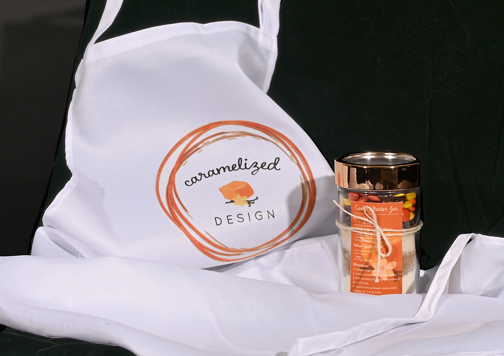
With our design we wanted to show the decorative art within baking with the rings having a caramelized texture.We went with a script type for the word caramelized and decided to use all lowercase to represent that friendly family aspect. For the word design we decided to go all caps with a san serif that has a comforting clean style, with having rounded edges to tape into that friendly aspect. Lastly, we wanted something that would easily identify us, so we created a caramel cube with a vanilla flower.
Typefaces Used
Boucherie Cursive
Quicksand
Colors
CMYK: 54,56,64,33
HEX: #63554A
CMYK:7,73,100,0
HEX: #E26626
CMYK:4,6,20,0
HEX: #F3E9CE
CMYK:3,3,7,0
HEX: #F5F2EA
Stationery System

Brochure

Website


Giveaway
As an incentive for accepting our design firm, we designed our apron and personalized treats for our clients.